附件:
重點
- 1.FontsArial is the preferred font for Gastroenterology and CGH figures. However, if you cannot use Arial, you must substitute another sans-serif font such as Helvetica. Serif fonts are not acceptable. (Serif fonts are a style of typefaces which have serifs, or small, extra strokes that adorn each character. Sans-serif fonts lack these extra embellishments; they are cleaner, simpler fonts, created from uniformly-weighted lines.)
Examples of serif fonts: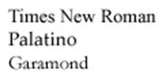
Examples of sans-serif fonts: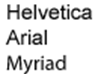
Symbol font may be used for special characters, and Courier may be used for sequence alignments. - 2.CapitalizationPlease use sentence-style capitalization within figures. Capitalize the first word of each figure axis, figure key label, figure title, etc.; subsequent words should be lower case. Single-word labels should all be capitalized.
- 3.Font sizesFonts should be 6 points or larger, but the largest font should not exceed 13 points (the only exception being 16-point panel labels [A, B, C]). Font styles and sizes should be consistent throughout your figures. All fonts must be legible at actual print size.
- 4.Scientific notationP values (probability) are capital and italicized, with no zero before the decimal (for example, P < .01).
r values (bivariate correlation coefficient) are lowercase.
R values (multivariate correlation coefficient) are capital. - 5.Gel electrophoresis labelsProtein molecular weight or DNA marker sizes must be indicated on all figure panels showing gel electrophoresis.
- 6.Graph styleGraphs should not include hatches or other patterns. Instead, choose colors or shades of gray with enough contrast to stand out and make clear the meaning of the graph. Graph bars should be delineated with grays that differ by at least 20% in value. Graph lines should be .75—1.0 line weight. Please do not submit 3-D style graphs.
- 7.Axis labelsLarger X and Y axis labels should be bold Arial. Axis numbers should be slightly smaller, using regular Arial. Use only X and Y axis lines, when appropriate. Avoid the use of complete boxes to enclose graphs. Use tick marks for only the major axis labels; smaller tick marks should be left off.
- 8.Figure keys and figure legendsFigure keys must be included within the figure, not the legend. Figures legends should be saved as part of the main text, not within the figures.
- 9.Color and grayscaleKeep in mind that figures might be photocopied by readers. Also, individuals who are color-blind should be able to understand the meaning of your figures. Therefore, please avoid the combination of red and green. Make sure that lines, colors, and symbols are easy to read by using high contrast, easily distinguishable dotted lines. Additional information regarding use of color in figures can be found here:http://jfly.iam.u-tokyo.ac.jp/color/.
- 10.Figure layoutAvoid unnecessary spacing within your figure layout. In addition, avoid using unnecessary boxes (especially with heavy lines) to enclose graphs or images. This will ensure that your images and text conform to our journal style, and are as large and readable as possible.
- 11.Panel labelsEach panel of a multi-part figure must be labeled with a bold, capital, 16-point letter (A, B, C). Whenever possible, do not place this letter over other text or images.
- 12.Column sizesOur journal columns are as follows: 1 column = approximately 85 mm, 1.5 columns = approximately 133 mm, 2 columns = approximately 174 mm. Your figures should print at one of these sizes, and still be readable and high quality.